Kaya
Logo and packaging concept for Indian spice blends produced in Leipzig, Germany.

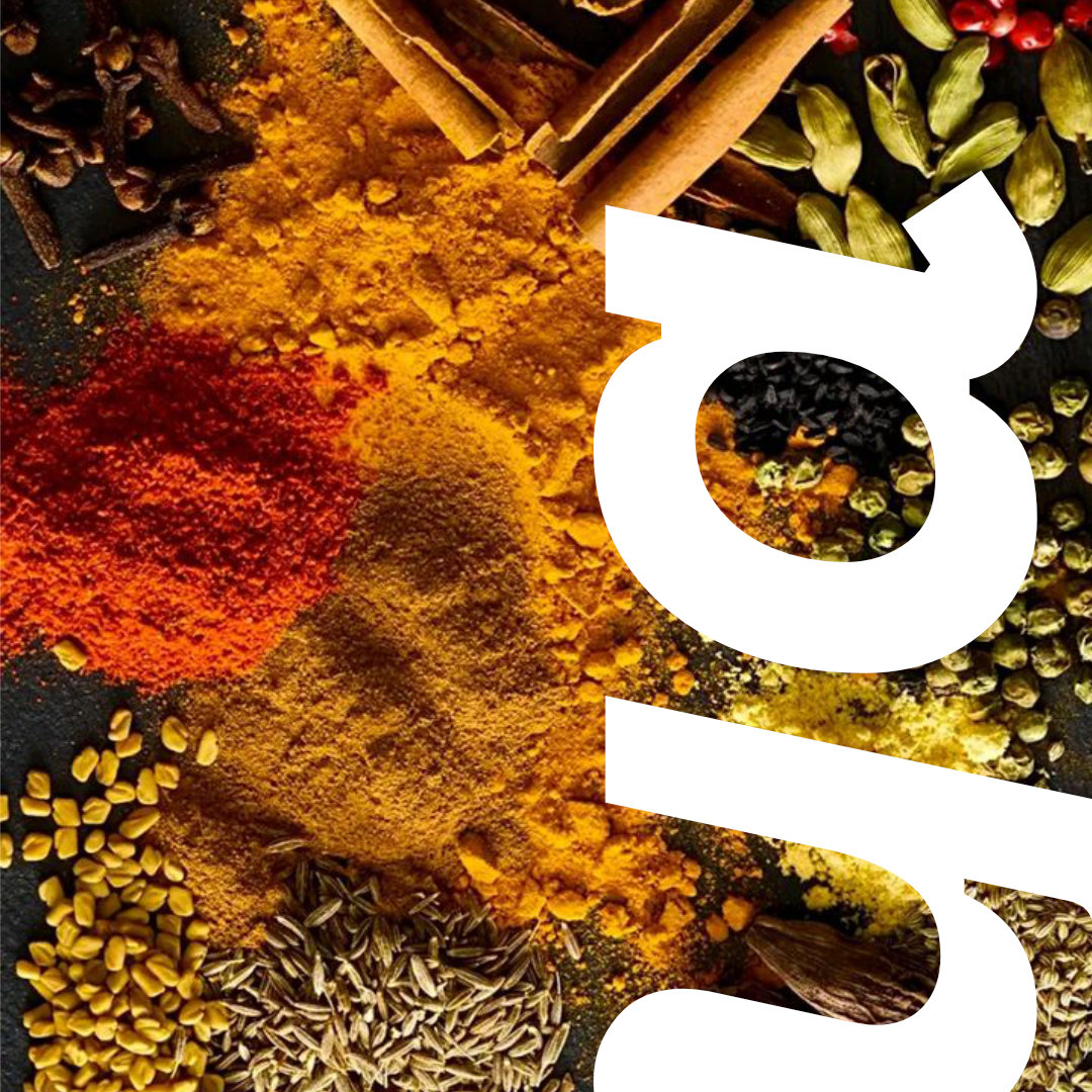
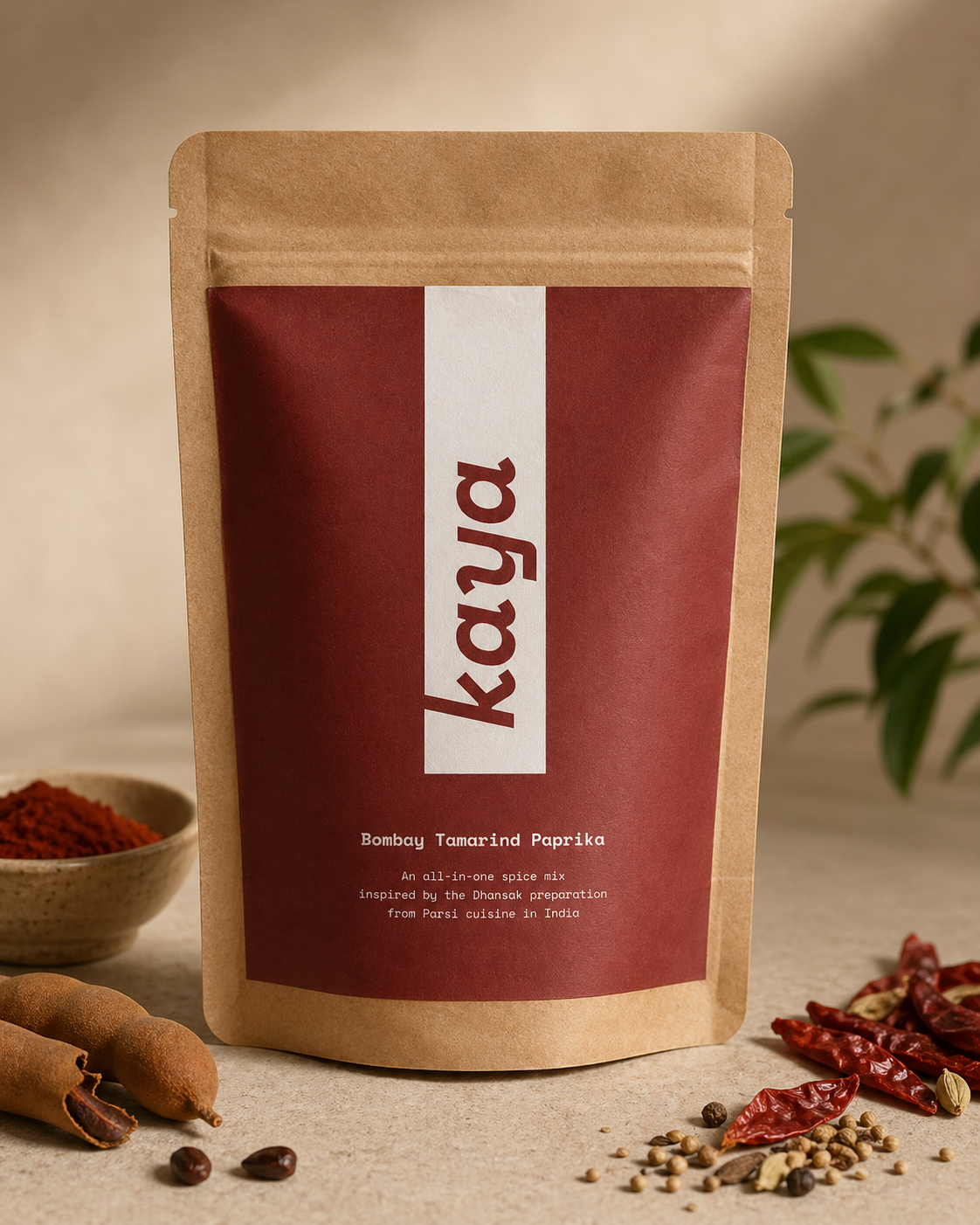
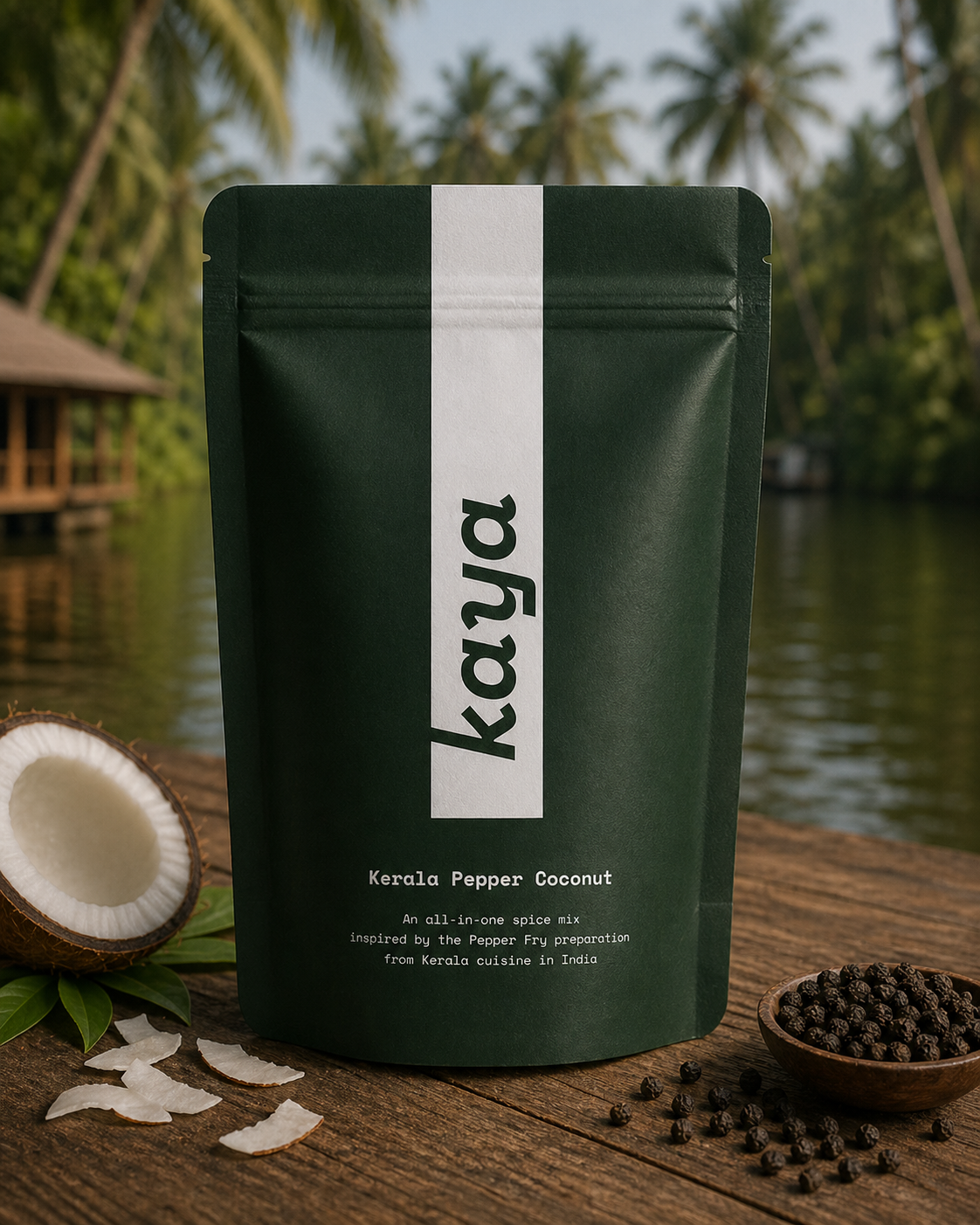
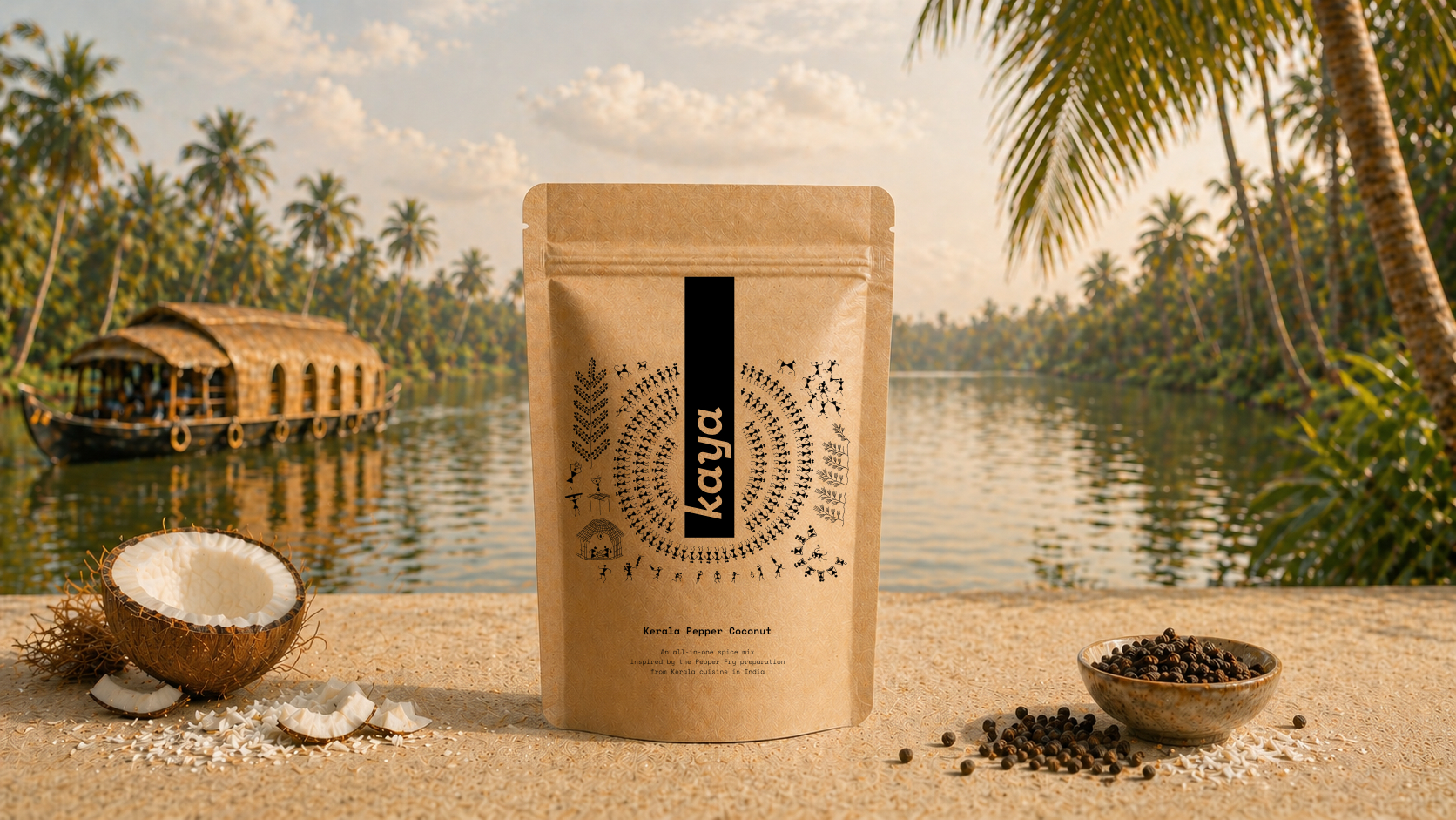
The inspiration for the logo came by accident. I rotated the letters “a” and “y” of the Space mono typeface by 90 degrees and noticed that they strongly resemble the script of the Indian language Kannada. It created the perfect association in my mind of what the product represents (inspired by India and hand-blended in Germany) and is also an homage to the founder’s home state in India, Karnataka.